


OR the Early Espresso Spice:

Which one do you like better and why? Click the photos to enlarge to full size. Please vote and help me choose my new blog background! Also, what do you think of my new banner? Too busy? Just right Vintage Nouveau Fall? Let me know your thoughts - I need your feedback!
I'm really loving this Digital Kit! The Vintage Trinkets, Antique Brads and Crochet Trim Ribbon complement it so well. Can you tell how much I LOVE My Digital Studio? Now off to design more buttons for the blog!


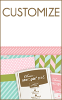
PRETTY!! I think I like the stripe better! I'm making cards using this stamp set...glad we got it FREE at the Baltimore Regionals!
ReplyDeleteThey are both really nice, but I like the early espresso one best. It makes the content of your blog really stand out.
ReplyDeleteI'm with Sarah - I like the stripe better too! Your header is GORGEOUS!! I can't wait to download those new goodies for MDS!
ReplyDeleteSusan, aka Soozie4Him on SCS
I like the strip one the best. I find the espresso one too busy and my eyes tend to go to the side of my screen to look at it
ReplyDeleteI like the Early Espresso version best. That paper is beautiful!!! Great job!!
ReplyDeleteI like the Early Espresso Spice much better...it's so much richer! Besides...clean and simple really isn't my gig. :)
ReplyDeleteThe Early Espresso Spice. It just pops I think!
ReplyDeleteWow! It's running neck and neck! Even among my family members. I need more votes everyone. Help me decide! When it' scrolling down, I definitely like the Early Espresso Spice one better. The stripe is too plain. But when it's at the top with the banner, I feel like it might be too busy and needs the stripe. What to do, what to do. Now you know why I need y'all!
ReplyDeleteso pretty!i like the espresso spice the best! i am a sucker for browns and it just makes me wanna rake some leaves and throw my kids in!!!
ReplyDeleteI like the early expresso! It really makes the text part of the page stand out (to me at least!) And the banner is PERFECT!
ReplyDeleteFrom one demo to another, I have to say the early espresso spice makes you focus more on the blog information. The lines are nice but it tends to blend in with the information.
ReplyDeleteSo my vote would have to be the Early Espresso Spice.